New York Public Library’s E-Reading App


Overview
As part of a major modernization initiative, NYPL made the decision to move beyond its existing e-reading app, SimplyE, and develop a completely new product from the ground up. Backed by key stakeholders, the project focused on addressing longstanding user pain points, introducing essential features missing from SimplyE, and building a more intuitive, flexible platform for readers.
The new eReader app goes beyond digital borrowing—it reimagines the full reading experience by integrating both print and digital lending into a single, user-friendly ecosystem. The scope spans mobile platforms (iOS and Android), catalog integration, vendor selection, content curation, and rethinking how the library engages patrons in both digital and physical spaces.
My Role
Led the end-to-end design process:
- Discovery & stakeholder workshops
- Co-leading user research with UX researcher Lily Mathews
- Wireframing & prototyping key flows
- User testing (remote moderated sessions)
- Brand Strategy
- Designing brand direction & advocating for a new visual identity
Key Team
- Sr. Product Manager - Risa Wolf
-
Project Manager - Stephanie Mannheim
-
Front-End Tech Lead - Samantha Andrews
-
Mobile Lead - Russell Cullen
- iOS Engineer - Ettore Pasquini
1.1 Research: SimplyE Audit & Asking Our Patrons
In the initial phase of the NYPL e-reading app redesign (September to October 2021), we conducted an audit of SimplyE paired with user research. Interviews with 10 readers and 8 recommenders helped identify key issues like onboarding challenges, device compatibility, and a need for a more personalized experience. These insights informed the design of a more user-friendly and intuitive platform, guiding our subsequent sprint planning and design efforts.
 Screenshots of SimyplyE
“The biggest thing is people wanting to read on their phones...a lot of times if you look it up, their device is not compatible. A lot of our patrons have very old technology...The patrons that are not tech savvy...they're the ones that come to the branch. And helping them is obviously going to be a bit more difficult because they do not have that technology.”
- Elissa, Librarian, Kips Bay
- Elissa, Librarian, Kips Bay
“I change the font size... I like reading really big words as if I'm, you know, elderly. I don't know why, it's just my preferred way...I also prefer reading [on the Kindle] because I don't really get, like the shine that I get on the phone…And the fact that when I'm on my Kindle, I can't get distracted by things on my phone.”
- Lauren, Simply-E User
- Lauren, Simply-E User
“All the covers are helpful from a visual perspective...if I'm in a mood where I don't really know what I want, the staff picks are most helpful for me because it's easier...it's kind of pre-selected by a human already.”
- Nancy, E-Reading User
- Nancy, E-Reading User
1.2 Research: In-App Hard Copy Checkout Research Workshop
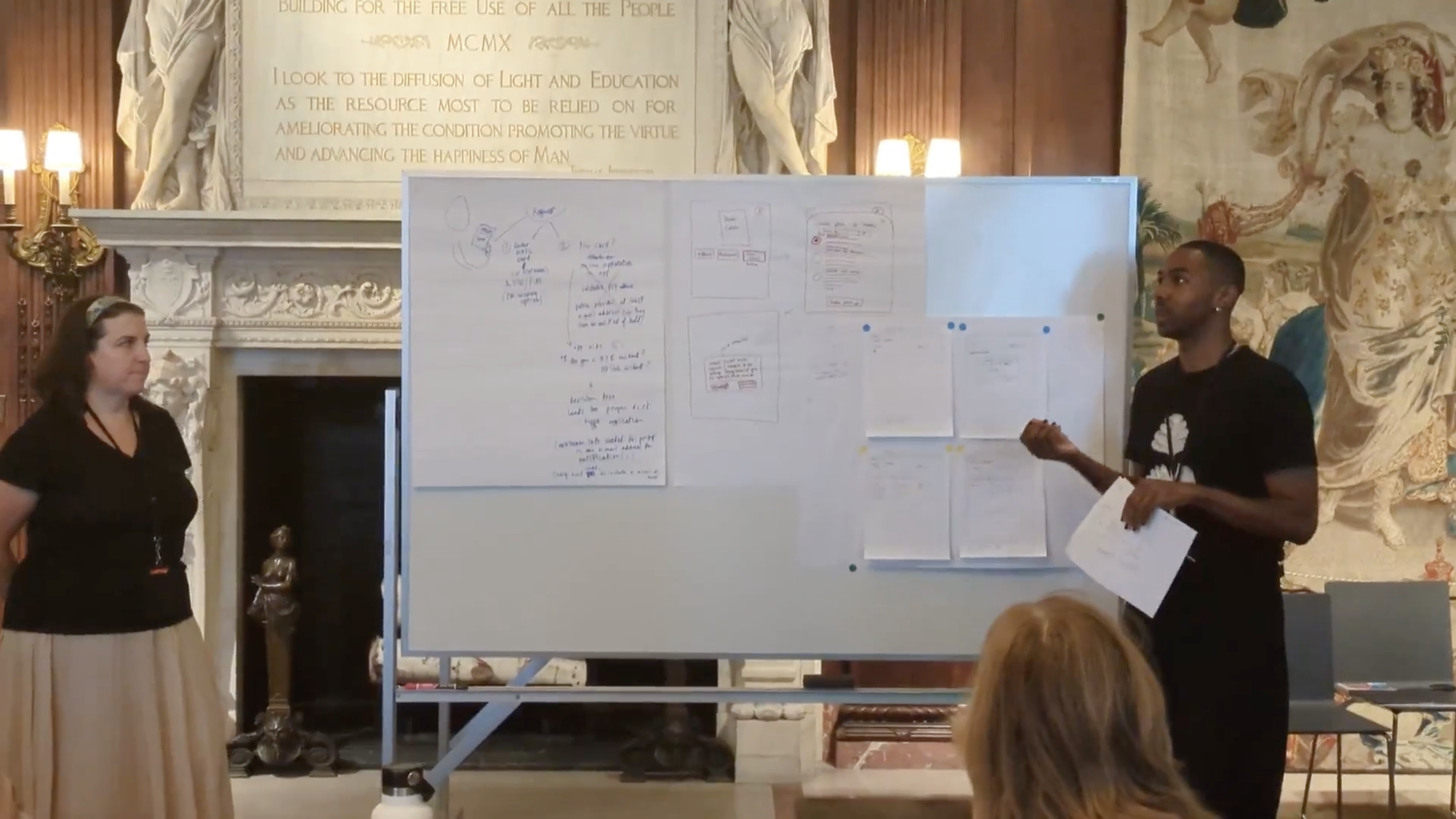
The physical checkout process was particularly complex, touching multiple systems and departments. I co-led a 2-hour in-person workshop alongside the Head of Product & Design, Director of Product, and Associate Director.
We invited cross-departmental NYPL staff to co-create solutions, guiding teams through rapid ideation using a “Crazy 8’s” framework. Each group selected and iterated on their strongest idea, presenting workflows for how print lending could be integrated into the app without overloading the user or the system.
You can find a short video of the workshop here.
1.3 Research: Understanding the Holds Process
As part of NYPL’s initiative to integrate print book reservations into the NYPL Reader app, I partnered with Product Manager Risa Wolf, to conduct a listening tour across four library branches. We interviewed seven librarians to map the end-to-end process of placing and managing print holds.
Our research revealed systemic challenges, including manual processing inefficiencies, patron confusion between print and eBook holds, and unclear communication around hold statuses. Despite branch-specific nuances, common themes emerged—particularly around outdated workflows and user misunderstandings.
Key recommendations included enhancing app features with progress tracking, clearer notifications, and visual guidance to better educate patrons. We also identified opportunities to refine physical hold slips and improve language consistency across touchpoints. This work would lay the foundation for user-centered solutions that bridge digital and physical library experiences.
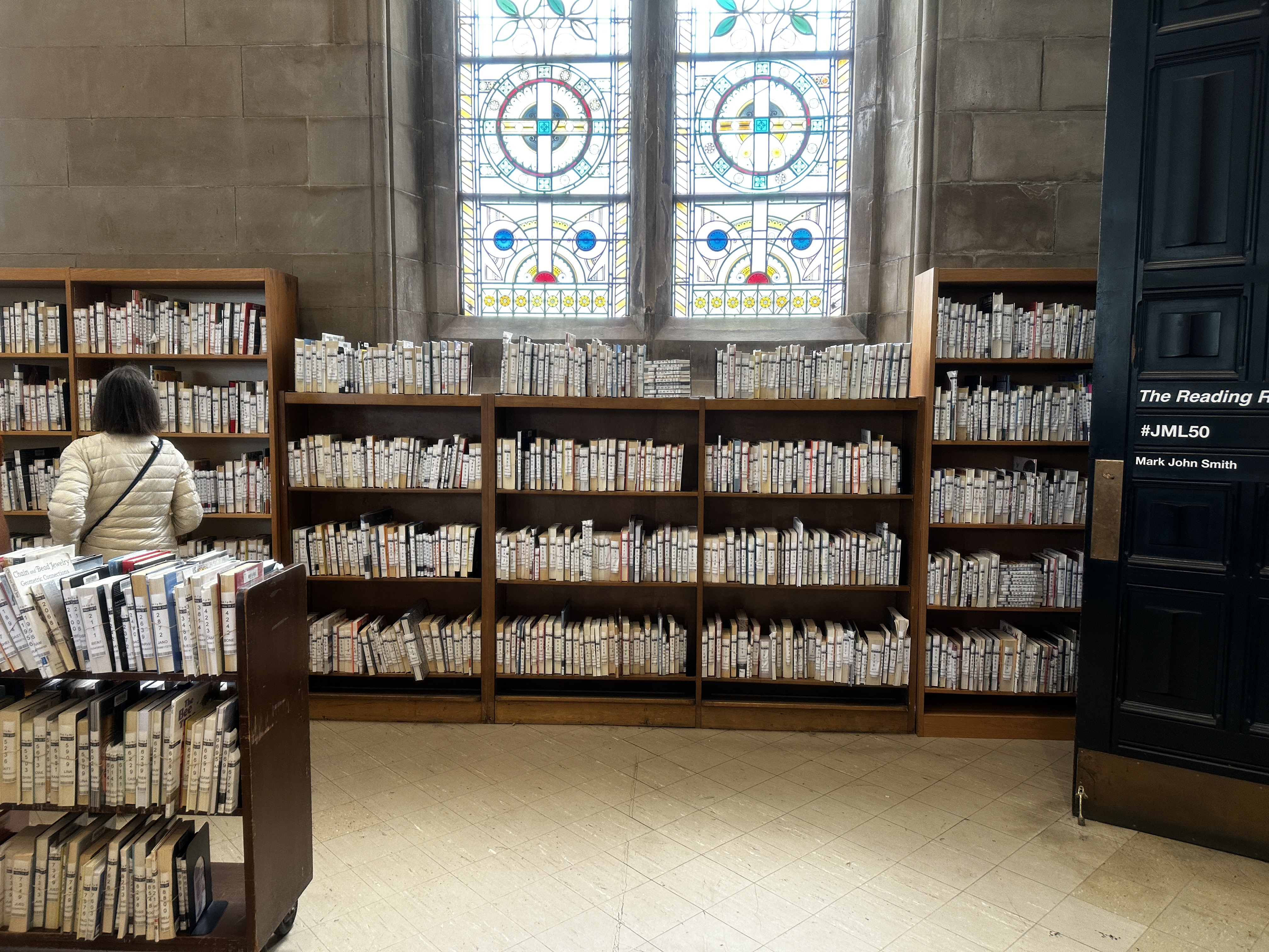 Shelves filled with holds at Jefferson Market Branch Library
2.1 Wireframing: Format Selection and Checkout
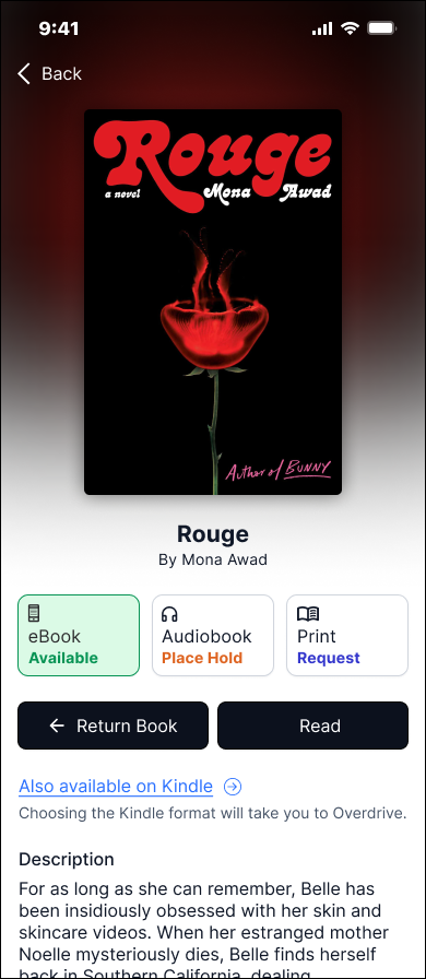
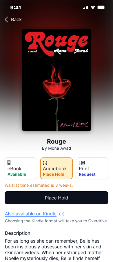
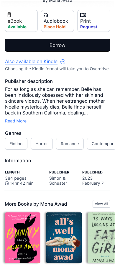
A major focus of my work was clarifying the checkout experience across eBooks, audiobooks, and—for the library’s first time—physical books. There was such a major focus on this flow because it was the essence of our mission, bridging the gap between our physical and digital spaces for patrons.

2.2 Wireframing: Search and Browse
Examining our users' methods of book exploration and search constituted a pivotal focus area. In the past, the search functionality in SimplyE proved lackluster, failing to encourage thorough app exploration. In the pursuit of effective browsing and searching within our app, I delved into examples from other platforms that adeptly guide users in optimizing their quest for desired content.
To inform these efforts, I analyzed discovery flows in adjacent apps like Spotify, Goodreads, and Libby, identifying best practices for guiding users toward content that feels relevant, fresh, and engaging.
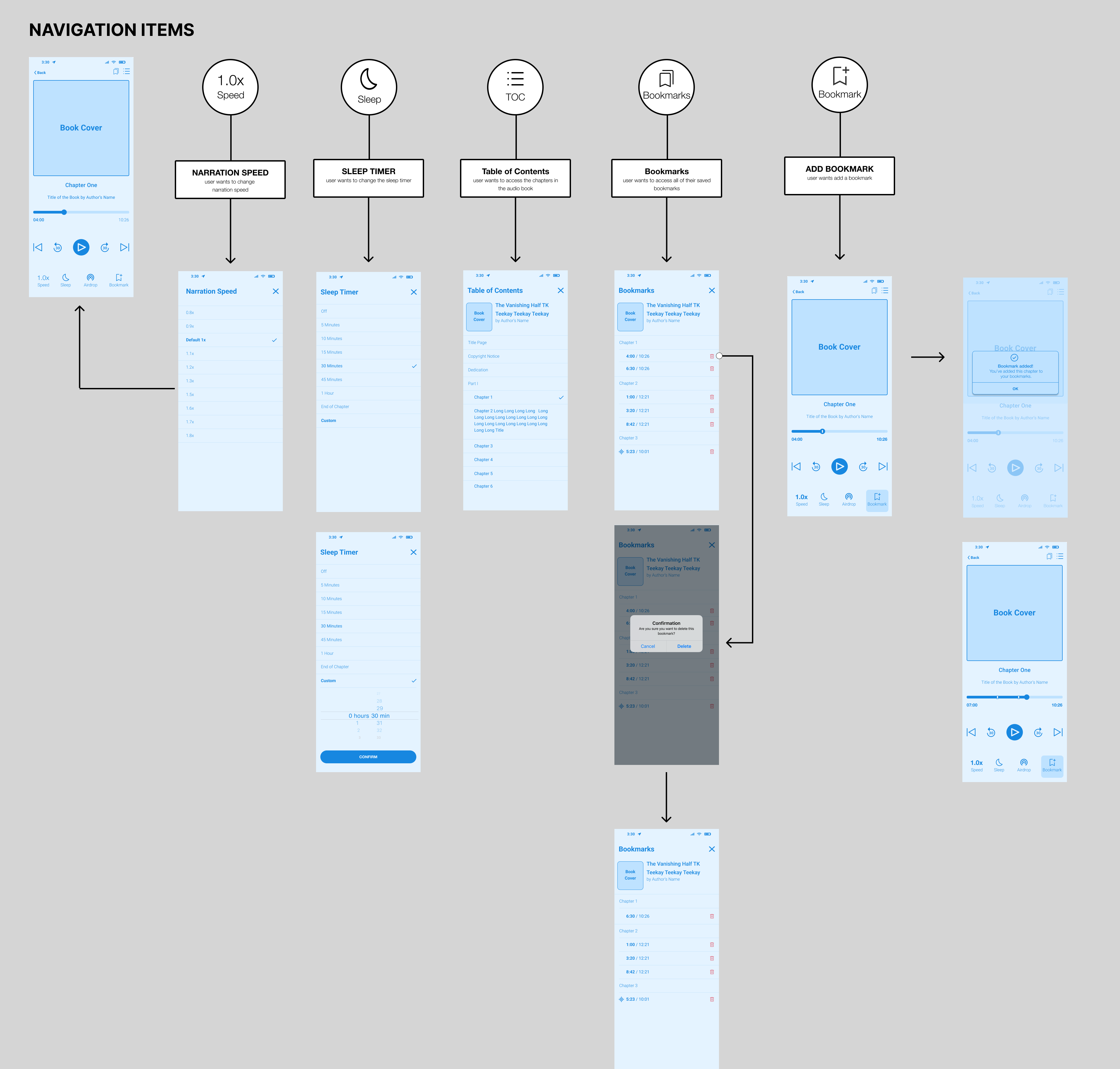
2.3 Wireframing: Audiobook Player
The SimplyE app lacked support for audiobooks, making it essential for the new app to not only accommodate audiobook formats but also optimize key features for a seamless listening experience. Our priorities focused on getting core functionalities right, including narration speed control, a sleep timer, table of contents navigation, and bookmark management.
3.1 Mid-Fi Designs & Tech: Discovery & Book Detail
As the Digital department, we shared our progress to gain buy-in and align teams across the library system. While shaping the branding, we developed a mid-fidelity app to help engineers visualize core components and anticipate code restructuring. This approach intentionally stripped away some in-progress features to focus on the core user journey of the e-reading experience. By clearly communicating that these designs were exploratory and intended for internal staff, we fostered transparency and collaboration across teams.
These designs enabled engineers to build a functional version of the app, which was released to internal staff via TestFlight for early testing and feedback.
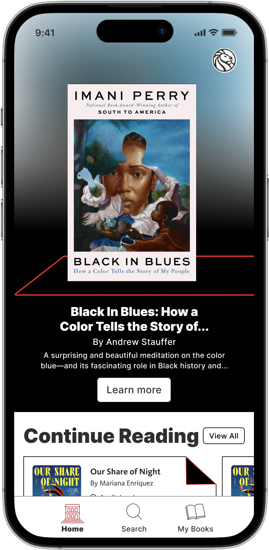
Discovery “Home”

Book Detail, “Available”
![]()
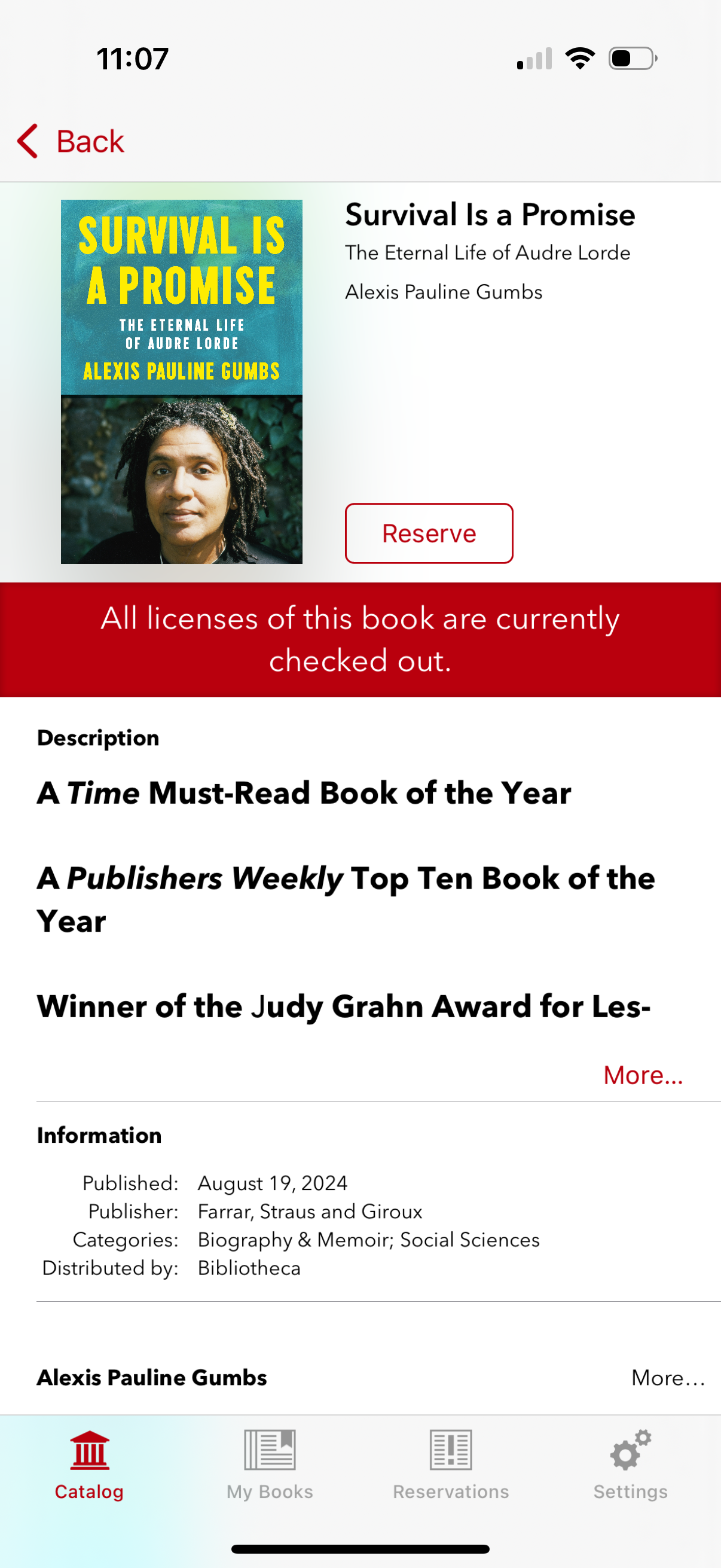
Book Detail, “Place Hold”
![]()
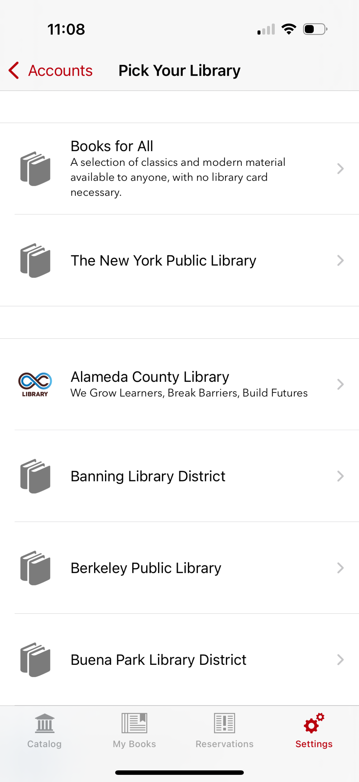
Book Detail Information
![]()
Sign-In
![]()

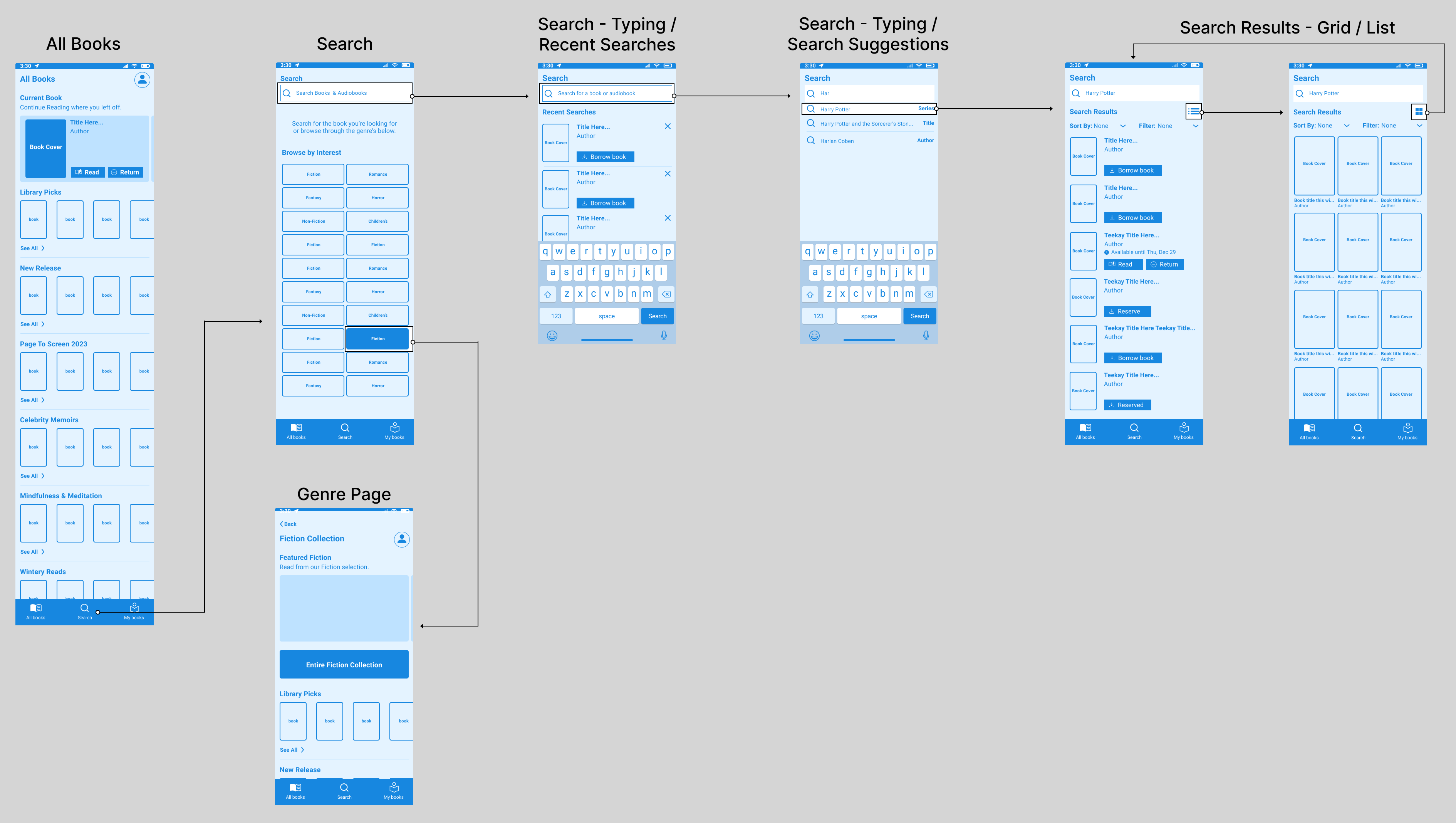
3.2 Mid-Fi Design & Tech: Search & Browse
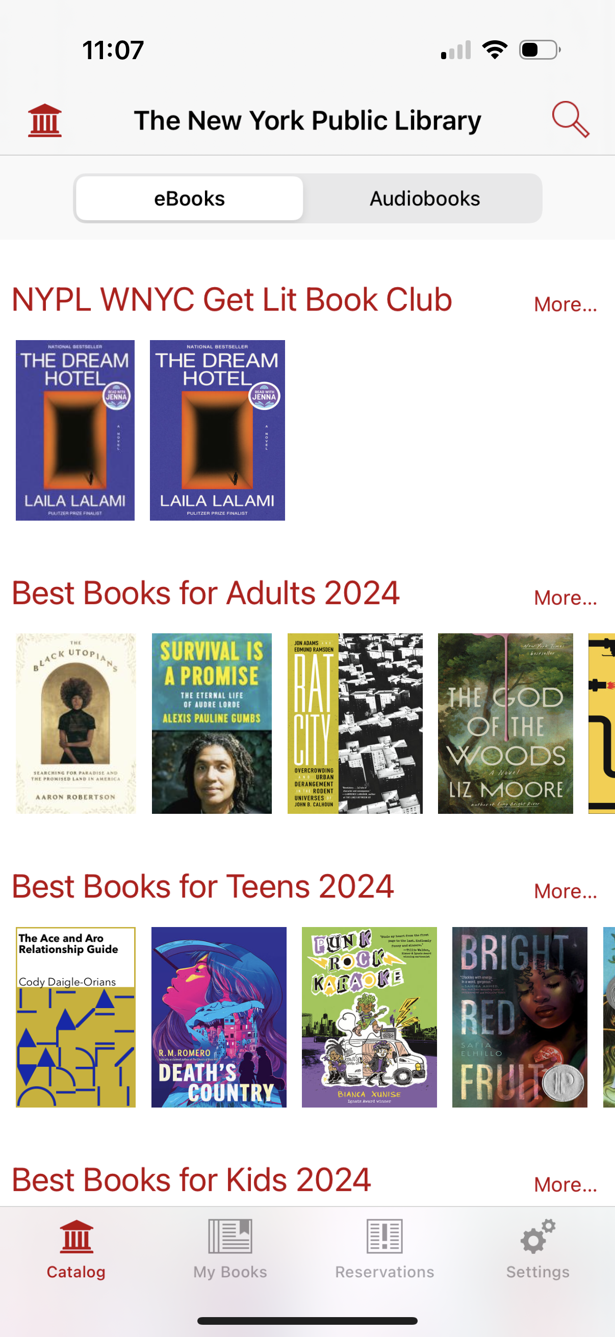
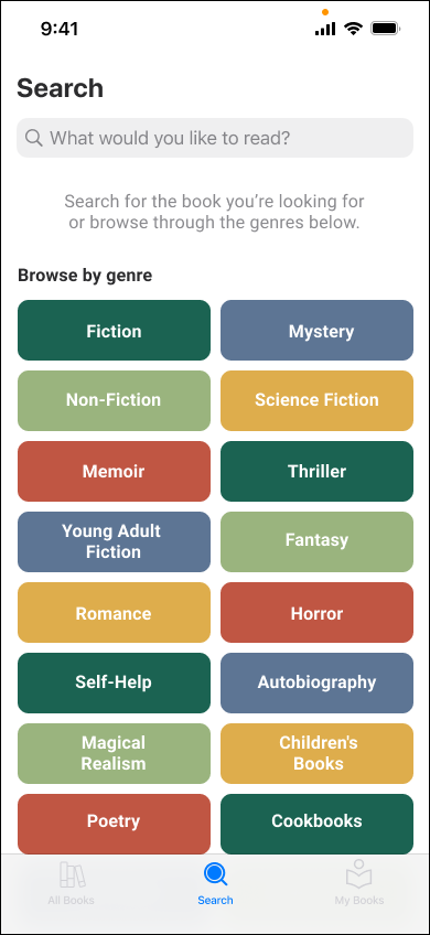
The new landing search page allows patrons to search directly or browse genre collections in one place. Tapping the search bar surfaces recent searches—a frequent patron request for tracking book availability. As users type, smart suggestions appear, indicating whether results are authors, titles, or series to streamline the process. Search results include filter and sort options, along with a grid or list view toggle for a more personalized browsing experience.
Recent searches
“This is a helpful way for me to remember...in Libby I think it retains my last 10 or 20 searches. I often reference that when I see if a title I decided to hold off on is now available.”
- Jaime, Libby User
“This is a helpful way for me to remember...in Libby I think it retains my last 10 or 20 searches. I often reference that when I see if a title I decided to hold off on is now available.”
- Jaime, Libby User


3.3 Mid-Fi Design & Tech: Audiobook Player Designs
The audiobook UI didn’t need to be overly complex or stray from familiar audio player patterns. Instead, we focused on subtle enhancements that improve usability, accessibility, and bring the interface to life. A soft, pulsing color—sourced from a blurred version of the book cover—adds a dynamic touch, breaking the static experience while providing a gentle visual cue for play and pause states.
To further support accessibility and precision, we refined the progress marker interaction. Patrons can press and hold the marker, triggering a time indicator above their thumb for accurate navigation to the desired timestamp.


4.1 User Testing: Prototype for Patrons
In partnership with UX Researcher Lily Mathews, we conducted 12 remote 1:1 moderated interviews to test low-fidelity prototypes, focusing on two core user groups: Libby users and SimplyE users. We explored how patrons search, browse, and evaluate books—paying close attention to the decision point where they choose to engage with a title. Our goal was to validate new interaction patterns that promote deeper exploration, addressing areas where SimplyE had previously fallen short.
Choosing a format
“Usually I'm not browsing for a physical book. I'm looking for a particular title. Depending on how quickly I need or want it, I will get the e-copy because most of the time, I’m impatient. I'll take whatever’s available.”
- Aimee, SimplyE & Libby User
“Usually I'm not browsing for a physical book. I'm looking for a particular title. Depending on how quickly I need or want it, I will get the e-copy because most of the time, I’m impatient. I'll take whatever’s available.”
- Aimee, SimplyE & Libby User
Recent searches
“Sometimes I’ll have a title on my list to look up. Other times, it’ll be late at night in bed and I’m just looking for something to start. It just depends.”
- AC, SimplyE User
“Sometimes I’ll have a title on my list to look up. Other times, it’ll be late at night in bed and I’m just looking for something to start. It just depends.”
- AC, SimplyE User
Aesthetic
“It has a really fresh feel to it. Sometimes when I think about libraries, I think old, outdated. But this gives bright and inviting and it seems very easy to navigate, which I think is the most important thing.”
- Bianca, Libby User
“It has a really fresh feel to it. Sometimes when I think about libraries, I think old, outdated. But this gives bright and inviting and it seems very easy to navigate, which I think is the most important thing.”
- Bianca, Libby User
5.1 Branding: Branding & Strategic Influence
Beyond UX, I saw an opportunity to reframe NYPL’s visual and cultural presence. Partnering with Lily Tran, Senior Product Designer for Digital Collections, we curated a shortlist of branding agencies to elevate NYPL’s identity as both the fourth largest library and a forward-thinking cultural institution. My pitch to leadership focused on leveraging design to strengthen ties with New York’s creative communities, leading to a partnership with Linked By Air—whose success with The Book of Hov helped secure buy-in.
Over the course of a year, I worked alongside Linked By Air and internal departments on naming, branding, and component design. I provided key frames from our mid-fidelity prototypes to guide the creation of branded components. This was a pivotal moment, as it marked the first time many teams engaged directly with a design agency. I helped bridge conversations across departments, distilling varied feedback into clear direction that prioritized the app’s true needs. Together, we restructured designs to balance internal input with a cohesive, future-facing product vision.
Over the course of a year, I worked alongside Linked By Air and internal departments on naming, branding, and component design. I provided key frames from our mid-fidelity prototypes to guide the creation of branded components. This was a pivotal moment, as it marked the first time many teams engaged directly with a design agency. I helped bridge conversations across departments, distilling varied feedback into clear direction that prioritized the app’s true needs. Together, we restructured designs to balance internal input with a cohesive, future-facing product vision.
6.1 The Future
As we welcome a new Chief for the Digital Department, we have restructured some priorities and have delayed the release of this app. Originally slated for November it has been pushed to spring of next year with talks of expanding the app as a more grand, all encompassing, library app for the entire NYPL system. This could potentially include research, branch-by-branch needs, and much more.
Our current focus is developing a robust design system that defines and organizes these design elements, behaviors, and guidelines.
Stay tuned!