NYPL Treasures Exhibition, the Audio Guide & Exhibition Experience
Overview
The New York Public Library was preparing to launch its largest exhibition to date, The Polonsky Exhibition of The New York Public Library's Treasures. At the time, NYPL lacked a digital presence for exhibition pages and had no living audio guide. I had the opportunity to take on both challenges—designing the exhibition website and developing the accompanying audio guide—as my first project at the Library, helping bring these treasures to life for a wider audience.
My Role & the Team
UX Designer
Product Manager - Miguel Rayos-Velazquez
Director of Product Design - Sharon Denning
Director of Exhibitions - Declan Kiely
Engineering Team - Advomatic (Vendor)
1.1 Wireframes: Exhibition Pages
My first step was to establish a clear understanding of how users would engage with the exhibition by mapping a visual user journey to align requested features with real user needs. To further support this, I invited my friend Colin from The Whitney Museum’s digital team to share insights on the advantages, challenges, and lessons learned from their own exhibition pages and audio guide development.
With the user flows approved and tight timelines in place, we moved directly into design. The project fell under NYPL’s Digital Experience (DXP) portfolio, which manages the main website and was in the early stages of developing a design system shared across three portfolios. The exhibition pages and audio guide became a proving ground—a kind of "Mr./Ms. Potato Head"—for this evolving system. Throughout the process, I identified and designed missing components, helping to fill critical gaps and strengthen the foundation of our growing design system.

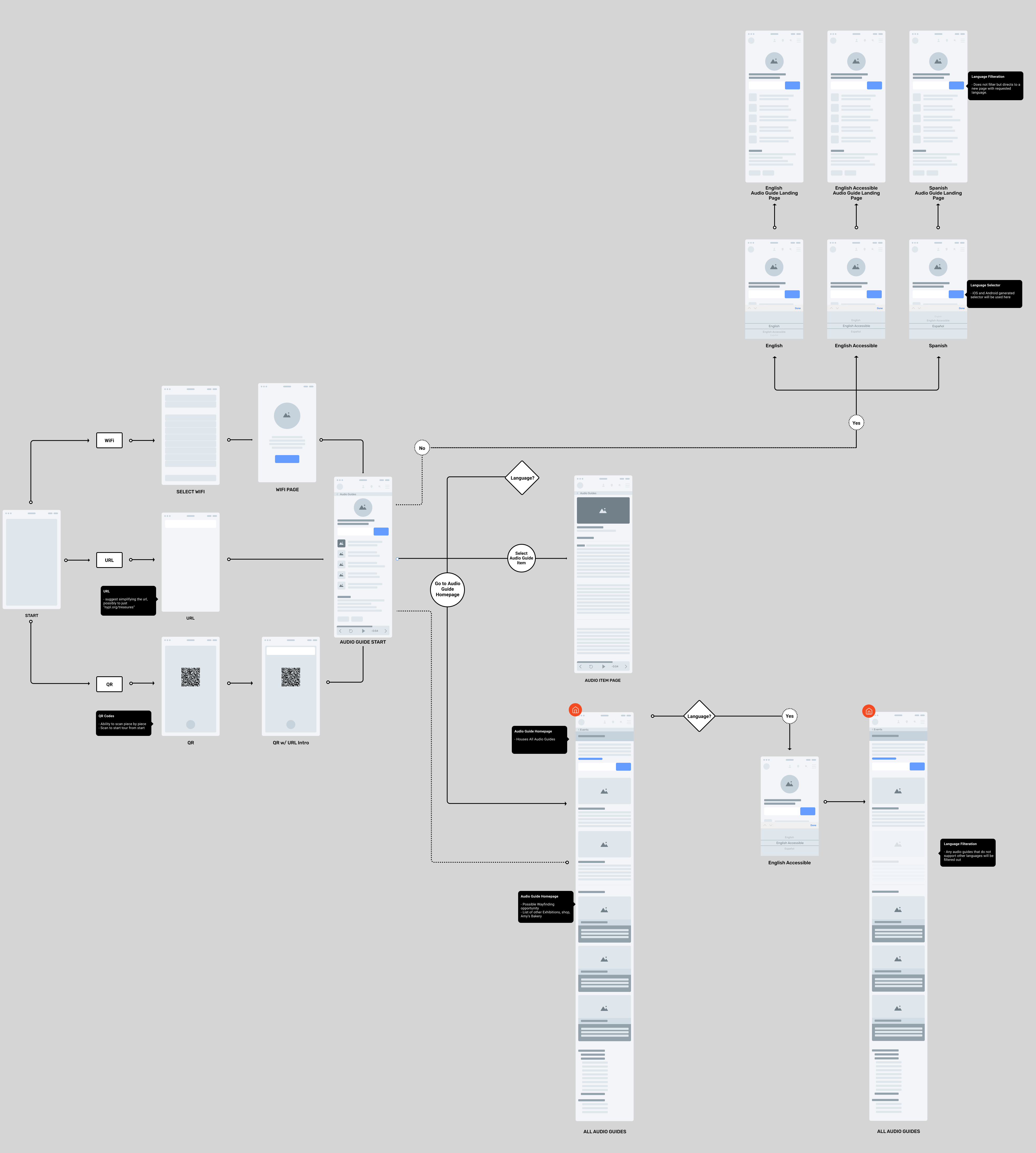
1.2 Wireframes: Audio Guide
A critical aspect of this project was ensuring seamless access to the audio guide. We knew that if patrons encountered frustration at the start of their journey, it would negatively impact their overall experience. Initially, I was told patrons would “just” type in a URL to access the guide—a solution I quickly flagged as problematic. The original web address was too long, creating unnecessary friction, especially for older adults or visually impaired users. While we shortened the URL, I advocated for a more intuitive approach: introducing QR codes, not only for the full collection but also for each individual piece. This provided faster, easier access—whether patrons wanted to explore the entire guide or engage with a single item of interest.
Language accessibility was another key consideration. While NYPL faces significant challenges in achieving true multi-language support across digital platforms, we identified practical solutions to help bridge this gap and reduce frustration for non-English-speaking patrons.
2.1 Design System: Components
At this time, the entire product design team was fairly new at the library. While we all had our own projects, we simultanousely worked on the design system that would bring all of our projects consistency. This particular project had a lot of components that were not yet in our system. Particularly the slideshow, audio player, and even content cards.
3.1 UI Design: Audio Guide
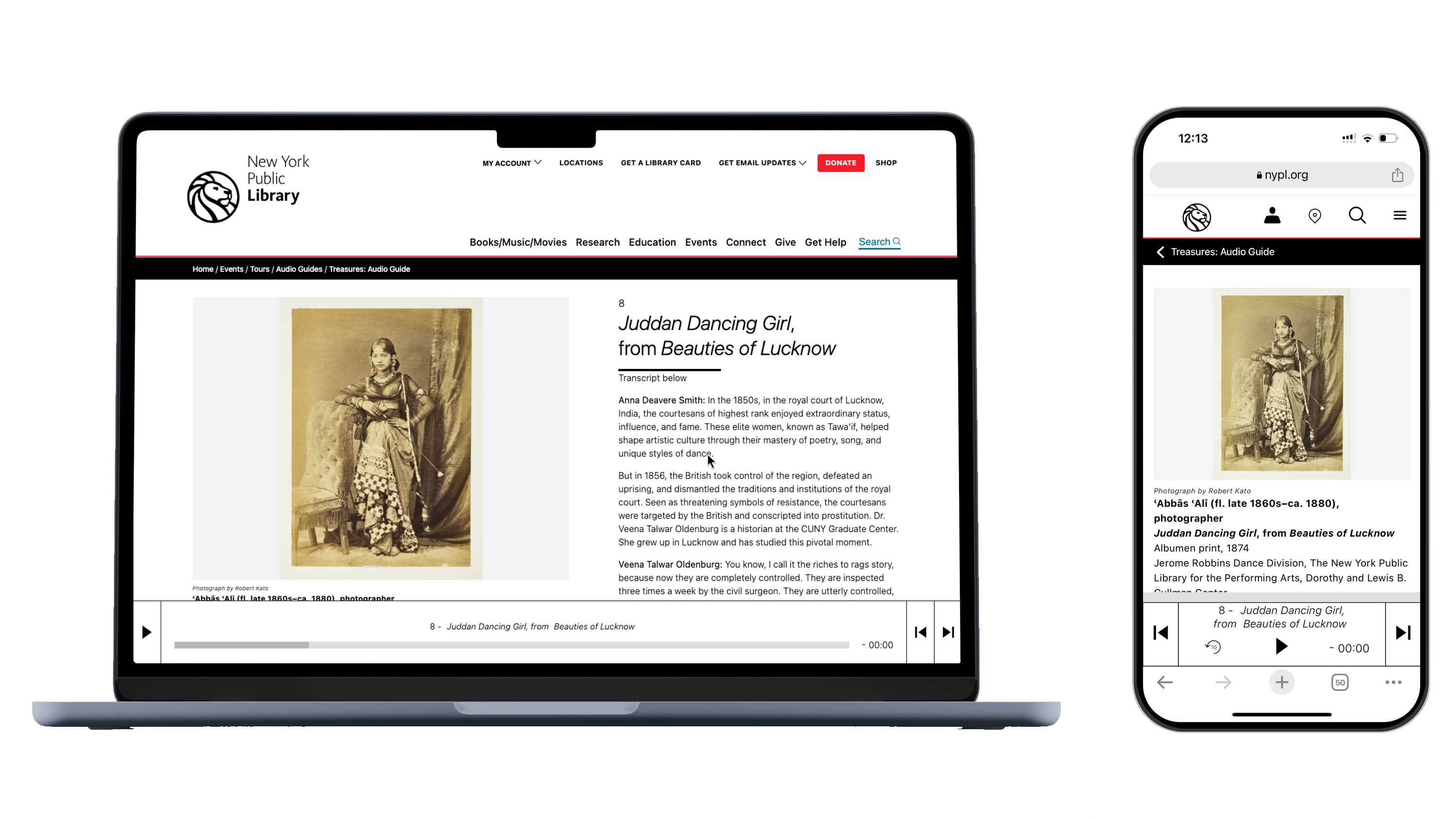
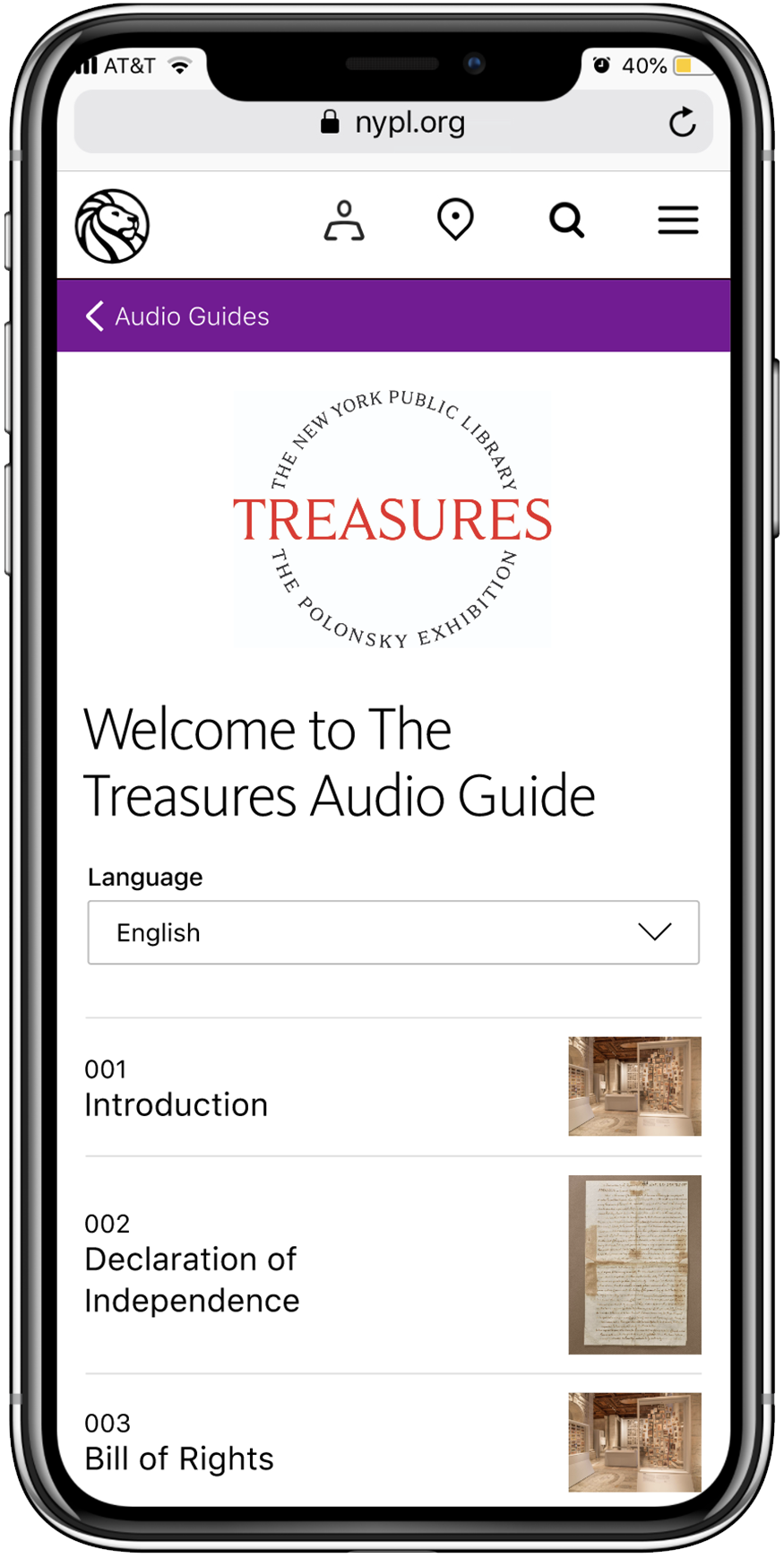
Most components were built using the library’s design system, but I took every opportunity to push the design further—especially with accessibility in mind. Users could access the audio guide by typing the shortened URL or, more seamlessly, by using our QR code system. Once in, they could easily switch languages if needed. Scrolling down, users would see a list of on-display exhibition items, allowing them to explore in order or select specific pieces of interest.
On each item page, users are presented with the image, title, and a full audio transcript. Ensuring the inclusion of transcripts was a priority for me, as it reinforced our commitment to making the experience accessible to all patrons, including those who are hearing impaired or who prefer reading alongside listening.
The Audio guide is currently live and can be viewed in real time on both desktop and mobile devices here.
3.2 UI Design: Exhibition Pages
The exhibition pages provide access to both audio-guided items and pieces not currently on display. The core goal was to create an online experience that feels as seamless and engaging as visiting the physical exhibition. Features like the slideshow navigation—with previews of the next or previous item on hover—and a list of remaining exhibition items beneath the selected piece allow users to explore intuitively, whether browsing in sequence or jumping between items spontaneously.
The Exhibition pages are currently live and can be viewed in real time on both desktop and mobile devices here.

4.1 User Research: Preparation
For the TWP project, we conducted remote user testing to validate the strategic vision for NYPL’s new exhibition web pages and audio guide. We segmented participants into three key user groups: Sightseers, Researchers, and General Public, ensuring a diverse range of perspectives including tourists, students, librarians, and museum professionals.
Using low-fidelity prototypes, we tested both mobile and desktop experiences, focusing on how users navigated the audio guide, exhibition galleries, and key interaction points. Our approach prioritized understanding user expectations, ease of navigation, clarity of terminology, and accessibility—particularly around audio player functionality and content structure.
The sessions were designed to identify pain points early, focusing on user flow rather than unfinished features. Insights from these tests informed critical decisions, such as simplifying access to the audio guide, refining content organization, and addressing language clarity. Data was captured through detailed observation, structured questionnaires, and follow-up discussions to guide iterative improvements.
4.2 User Research: Results
User testing showed positive reception across all user groups. Participants found the experience intuitive, with no major usability issues requiring redesign.
Conclusion:
No major UI changes were needed, but thoughtful editorial refinements and a persistent audio player feature were identified as key enhancements to improve user experience.
Conclusion:
No major UI changes were needed, but thoughtful editorial refinements and a persistent audio player feature were identified as key enhancements to improve user experience.
- Navigation & Usability: Users reported ease of navigation and clear understanding of core features. Both the Audio Guide and Exhibition Galleries were well-received.
-
Audio Player Improvement: The main recommendation was to implement a persistent audio player, allowing users to continue listening while navigating between pages—enhancing multitasking and overall experience.
-
Editorial Adjustments: Several minor changes were suggested to improve clarity, such as renaming labels (e.g., “Filter by Language” instead of “Language”) and providing more descriptive summaries to guide users, especially older demographics.
-
Content Structure: Users generally understood the structure of galleries but found terms like “Themes” unclear. A shift to more intuitive language like “Explore the Exhibition” was recommended.
- Feature Requests: Users expressed interest in additional features, such as image zoom or lightbox functionality for a richer viewing experience.
This is frustrating to me for one reason. She [audio guide voice] speaks very slowly, so I would want to forward her because her voice drives minutes. I’d pause the audio but where there’s a bar and I can’t really glide and it’s not reacting to me. There’s forward and backward which to me seems that I should be able to glide the bar. But if I hit the forward I’m in the next painting. One arrow means moving one item left or right.
- Anna Labykina, 45, Sightseer, mobile audio guide test
- Anna Labykina, 45, Sightseer, mobile audio guide test
I would rely mostly on physical navigation through the space, taking photographs etc. Whenever I go to every place I read what is the significance.
- Satinder Thakral, 65, Sightseer, mobile audio guide test
- Satinder Thakral, 65, Sightseer, mobile audio guide test
I would expect to be able to zoom into the image of the writing a little bit more to get information on it. I see the catalog, that’s good. I would assume that the links are locations in the library. This is also good because I’ve used online library resources and based on this I could find more related resources to this item.
- Maria De Los Angeles Rodriguez Jimenez, 28, Desktop exhibition gallery test
- Maria De Los Angeles Rodriguez Jimenez, 28, Desktop exhibition gallery test
5.1 Development
With the successful outcome of user testing and only minimal adjustments needed, we were ready to kick off development with Advomatic, our outsourced engineering partner. As a Product Designer, I worked closely with their team to ensure accurate execution of the designs—bridging the gap between design intent and technical implementation.
Throughout the process, I provided continuous visual QA, clarifying design details, addressing edge cases, and collaborating on solutions when technical constraints arose. Working alongside engineers required clear communication, flexibility, and a shared focus on delivering a polished, user-centered experience.
6.1 The Launch
The exhibition pages and audio guide are currently live. Visit the New York Public Library’s permanent collection in person at the Bryant Park branch! Feel free to tell me what you think ;)